
Monday, December 24, 2012
Saturday, December 22, 2012
APPRECIATE: blue christmas

Thanks to Elvis, blue and christmas is forever a bad combination.
But these days, Pocket Change is seeing blue for what it really is: a unique holiday color that captures the winter season. Unlike the classic Christmas red, blue is a cool color. It's the color your lips turn after that seventeenth ski run. Good design is sometimes so fitting that it is overlooked. A string of blue lights can look right at home against a dark sky and white snow. It's even a color known to have a calming effect, and if you've been to the mall lately, that doesn't sound like such a bad thing.
So next time your rainbow colored, blinking, singing, slightly obnoxious, string of lights goes on the splits, try adding a simple blue and your holiday will instantly calm.
-jules and nate.
Wednesday, December 19, 2012
PCDC at the end of the world

PCDC begs to differ. Here at Pocket Change, we believe the 21st of December will be the beginning of many new things, rather than the end of humankind's existence. After all, it's the winter solstice and our days will only get longer. That means there's that much more time in our day to hash out our business plan, research capitalization details, and OH YEAH, design. So keep an eye out for what we have coming!
And in case we're wrong about the impending apocalypse, at least our followers who live under a rock will appreciate this entry...
-jules and nate.
Tuesday, December 18, 2012
APPRECIATE: bar codes

Small joke, but in all seriousness, many these days have found online shopping to be a win-win when it comes to holiday gift preparations. The benefits of online shopping mean instantaneous results, and most importantly, no searching for a parking spot.
We can already tell that online shopping is the next 'simplicity to overcome habit', a definition previously describing the bar code in yesterday's Bloomberg Businessweek article that describes how the bar code came to manifest. Imagine waiting in the grocery checkout for the cashier to type in every number code of every item!? Pocket Change certainly wouldn't have the patience for that; appreciate the design of bar codes...
-jules and nate.
Wednesday, December 12, 2012
APPRECIATE: crisp weather
It's cold; there is no denying that! As winter sets in the city take a second when you head home from the office. Step outside and take a deep breath. Because the air is so cold your lungs can actually take in more oxygen giving you more pep in your step. So instead of rushing for the red line tomorrow morning take your time and enjoy the air!
Saturday, December 8, 2012
PCDC buzz!

Thanks to the Community Design Resource Center's reception, held on November 28 at the headquarters of the Boston Society of Architects, word has spread about the 9 competing gingerbread projects. If you didn't make it to the reception, or happen to walk down Congress Street last week to see the display, you can read what others, like BostInno and We Love Beantown, thought about it right from your computer.
And yes, that woman is totally checking out the blog...
-jules and nate.
Monday, December 3, 2012
APPRECIATE: Chairs
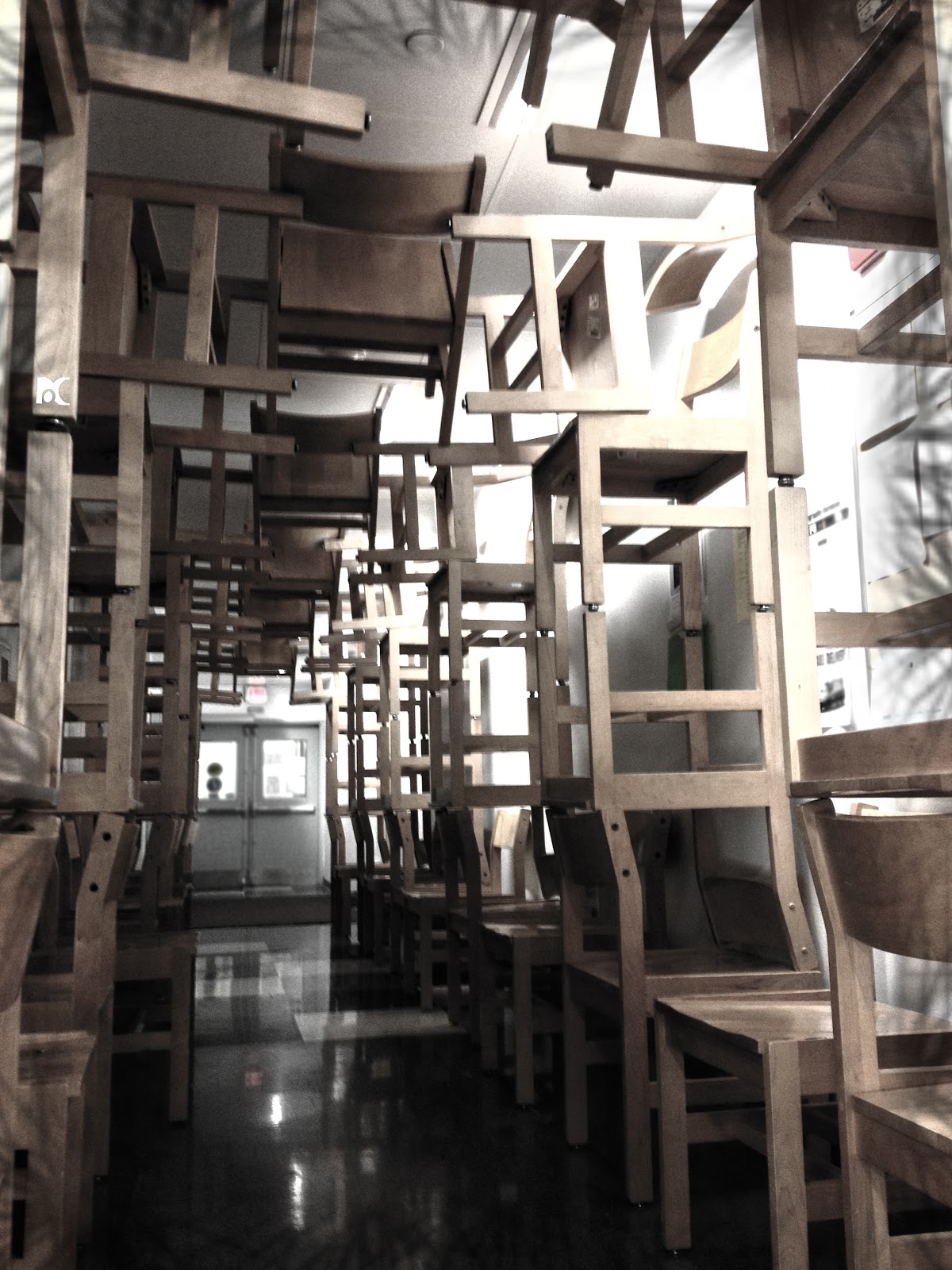 It's time chairs take on a new adventure. They are getting tired of being pushed in, rolled around, folded up, and staying on all fours.
Every object, whether useful or artistic should flip roles. It's time to appreciate the chair as a piece of sculpture. Chair sculptures show the unique structural character of a chair. A chair follows the same governing laws, we'll say tension and compression, as more common structural materials.
It's time to re-imagine the chair and push it to its limit, who knows, you may end up creating something fasinating out of something you sit on everyday.
Saturday, December 1, 2012
APPRECIATE: a red door

Either way, in the drab-almost-winter weather of a city, this dingy old red door is not afraid. Red is the color of energy, power, and strength. Red pops.
In appreciation of red, Pocket Change is doing some research. For starters, Mondrian was also an artist of red. His use of primary colors reflected more of his inner feelings, rather than the reality of an object. Artists are passionate people, it only makes sense that we're drawn to red, even if it is just the color of an old door to a city apartment.

Subscribe to:
Posts (Atom)